User Interface potentials for Valueflows
This is not a design for Valueflows UI or UX but a discussion of what kinds of UI/UX might be possible, appropriate, and useful. This will get long. Sorry. I'll pull it back to UI/UX considerations after some background. And contrast a bit with the popular Trello-style UI. Valueflows might have been named "resource flows" because that is what they are really about. The name "Valueflows" got the most votes when the first group of contributors wanted to set up a website and needed a name. So it's https://valueflo.ws/ forever. But it's really about flows of Economic Resources: following their movements back to their origins and planning and executing their movements into their futures. Stuff in motion, but not randomly. Stuff moving on paths that you create, and you also control the movements of the stuff. The structure is sets of input-process-output networks, where the processes are loosely connected when the output resource from one process becomes an input resource to another process. That same structure repeats on three interconnected levels: 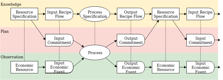 So on the Knowledge level, a Process Specification is loosely connected to another Process Specification when the Resource on its Output Recipe Flow matches the Resource on the Input Recipe Flow of another Process Specification. Or on the Plan level, Processes are loosely connected when the Resource on an Output Commitment from one Process matches the Resource on an Input Commitment to another Process. To be a bit more concrete: 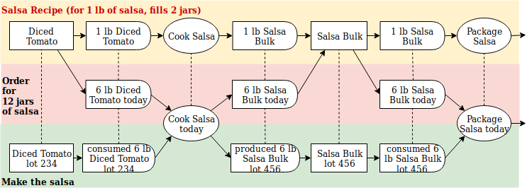 **Why are the processes loosely, rather than tightly, connected?** For example, why don't we just say that the first process is harvesting tomatoes, the second process is dicing tomatoes, the third process is cooking salsa, and the fourth process is packaging salsa? Because process flows are not always linear or predictable, and the resources from one process can go into more than one other process. For example, maybe when the tomatoes are harvested, some of them go into salsa, some into spaghetti sauce, some into salads, etc. And sometimes when they are harvested, their next processes have not all been decided. ## User Perspectives in the Resource Flows A user might might interact with those flows at any node on any level. For example, a user might want to create a Recipe. Or generate a Plan from a Recipe. Or create a Plan without a Recipe. Or manage a Process. Or execute an Economic Event (for example, dice tomatoes). Or a user might want to work at an even higher level, analyzing all of the resource flows in a Solawi (a community farm, see https://write.as/economic-networks/a-fractal-economy ) or all of the flows in a whole community, including a lot more than food. I'm thinking of something vaguely, but not exactly, like how a Miro board includes an overview of the whole board in the bottom right corner, showing an outline around the part of the board which you have in focus.  # What does all that mean for UI/UX? Let's contrast with [a Trello "kanban" card UI](https://trello.com/b/3ehBsvhL/ux-ui-design). The cards often represent "tasks": work for people to do. Tasks are not the same as Processes: a Process might have several "tasks" (work for people to do) as well as other inputs and outputs. The cards are arranged in columns, which usually represent management statuses, like Backlog, Doing, Done, etc. And moving a card from one status (one column) to the next happens by user action on the UI, regardless of the actual status - or dependencies - of the work. For example, somebody might move the Dice Tomatoes task to the Doing column, but the tomatoes have not yet been harvested, so no tomatoes can be diced. The vertical columns also do not show horizontal flows. So the Doing column might contain tasks for making salsa, baking bread, and making apple pie, while salsa, pie, and bread have separate process flows that do not intermingle. ## I depend on somebody else, and somebody else depends on me Also, each process in each of those flows has its own dependencies - what resources from which previous process need to be available before this next process can begin - and those dependencies are also invisible on the Trello UI. So a better card interface might include horizontal rows in addition to vertical columns, and some kind of signal whether the resource requirements for a process are available so some work can actually begin. Or who's waiting for the resources you are working on. Likewise a given person might have committed to do some of the work on a Trello UI, not not all of it. So another useful view might be My Work: what work have I committed to do, and are all of its required resources available? And why am I doing that? Where are the output resources going? Yet another view might be from larger perspectives: where does this task or Process fit into a whole project, organization, community, or regional economy? None of this discussion wants to suggest that a Trello-like card UI is the perfect choice for any and all situations. More analysis and more imagination might suggest totally different alternatives. But in Valueflows, those resource flows, on different levels, from different perspectives, are what you got to work with. Yes, the hip kiddies these days say "don't design your UI from the data model", but in this case, the structure described above is also the structure of the real-life flows, and is not the same as [the data model](https://speakerdeck.com/mikorizal/everything-in-valueflows-is-connected). # Yet another angle Experience has shown that all work and no play makes for dull experiences. And purely economic user experiences want to be intermingled with conversations about the economic stuff and also conversations about organizational issues, governance, global politics, the latest protest, the current fave entertainment, and what's going on with your health, family, garden, environment, etc etc. Here's a previous discussion of [combined social + economic UI/UX](https://cryptpad.fr/pad/#/2/pad/view/64P7o1b-7n8WCppvlhlHoC6xqs6TYqgfuQsE7rrMxn8/). Some creative work will need to be done about how the economic and social interactions intermingle.