Visual languages: Resource Flow Diagrams
This is the first example in a series of techniques for depicting economic networks, introduced in the previous post about Resources, Events and Agents, which is the vocabulary I will use for describing the diagrams.
The ValueFlows community (which is itself a cooperative economic network of cooperative economic networks) has wanted a visual language for describing flows in economic networks for a couple of years.
We settled on the basics of a style one year ago, inspired by string or wiring diagrams as used in the Applied Category Theory community (the Catsters, who are also a cooperative economic network). Here's an example, from the paper Seven Sketches in Compositionality: An Invitation to Applied Category Theory by Brendan Fong and David I. Spivak:

Two variations below will demonstrate some capabilities of that style.
That style is what we have been using in two related projects, https://valueflo.ws/ and https://github.com/holo-rea (each of which also constitute cooperative economic networks).
The diagrams show strings or wires or arrows between nodes, which can be individual or group Agents or Processes or Transfers or any mixture thereof, at any level of abstraction or aggregation that suits the purpose of the diagram.
For example, you could use individual Agents, or group Agents, or types of Agents, or Agents performing some function like farmers. You could use small or large-grained Processes.
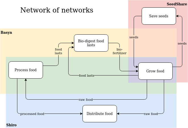
In this diagram, the Agents (Basyn,SeedShare, and Shiro) are whole networks:
The arrows are directed, from one node to another node, and Economic Resources ride on them. You could depict the Resources as labels on the arrows or separate named shapes.
The Resources are usually abstract rather than tangible: Resource Specifications or classifications or taxonomy items at any level of specificity. For example, an arrow could show Fruit, or Apples, or Granny Smith Apples, or Organic Apples from Eve's Orchard (which is a real place).
The Resources on the arrows could be quantified, and if so, you could vary the width of the arrow according to the quantity of the Resources on it, creating something like a Sankey diagram.
However, you could also create an animated diagram with tangible identifiable resources traveling on the arrows in near-realtime with the nodes geolocated on an Open Street Map.
The shapes don't matter, only that the reader be able to distinguish nodes from arrows and resources. The style as we use it is very flexible, but it's good to be consistent within a family of diagrams or a family of projects.
The diagram style comes from the Catsters, where they use them with mathematical rigor and consider them the logical equivalent of code or proofs. We will not try to use them so rigorously...yet. None of us understands enough Category Theory to do that, and we have not yet attracted any experienced Catsters to help us. But becoming more mathematically rigorous with our diagrams would be a good research project for somebody, and would probably enable some new and interesting capabilities.
Some capabilities emerge easily:
If a node has a resource arrow as an input but the arrow has no source, another node could be connected which can provide that resource as an output. Same with node with a resource arrow as an output but no destination, another node could be connected that wants that resource as an input. Likewise with resource arrows with quantities: if the source or destination quantity is less than the resource arrow quantity, other nodes could be connected to take up the slack.
For example all of the arrows in this diagram come from or go to other nodes that are not shown in that box:

You can also nest diagrams inside a box on a higher-level diagram fractally and drill down and climb back up. Like, here's the pie preparation diagram nested inside another diagram where the pie gets baked:

So as you might imagine in the network-of-networks diagram above, the details of each network can be depicted in other related diagrams. Sometimes more artistically, but still a resource flow diagram of part of the Basyn network:

Lots more examples at https://valueflo.ws/examples/ex-complex.html
Our diagrams are already rigorous enough to be able to be generated programmatically from data. Here are a couple of not-very-good proofs of concept that could be improved: * http://valueflows.pythonanywhere.com/vocab/egg2worm-flow/ (this diagram handles the eggshell waste from the pie-with-waste diagram) * http://valueflows.pythonanywhere.com/vocab/process-flow/ (that one is based on real data from http://nrp.sensorica.co/ ) More rigor might allow generating data from the diagram to make it executable by a program. I think we want to tread lightly into executable diagrams for operational use. Keep the humans in the loop more there. But they might be useful for simulations.
The name of the diagram style varies from one Catster publication to another. They mostly say String Diagram, but sometimes Wiring Diagram. Some of them consider those names to be synonomyms, some them assign different meanings to each name. I asked them which name we should use and the rough consensus seemed to be, if we are just using the diagrms to communicate with humans, it doesn't matter. If we become more rigorous and use the diagrams as code, it might matter.
Here is an overview and a bunch of references about string diagrams from a category theory viewpoint: https://ncatlab.org/nlab/show/string+diagram