Understanding KDE Plasma theming system
KDE Plasma's theming system is actually quite complex. It has many ways to be customized. It's normal ever for expert users to not fully get how it works. I'll try to explain how it works to the best of my knowledge.
For all of these topics, there's section on the KDE Store where you can see all the avaiable options and download them.
Global Theme
Let's start with the Global Theme. This has potentially control over many settings, but let's simplify it into the main smaller components it determines:
- App Style
- Plasma Style
- Colors
- Window Decorations
- Fonts
- Icons
- Cursors
- Splash Screen
- Desktop Layout
When a global theme is set it can set all of these things, but it does not have to set all of them. This means that setting a Global Theme is actually a potentially “destructive” action, meaning that you might have to re-set your preferred App Style, Plasma Style, etc. if you had customized them. In fact, you can customize each one of the above elements to your liking!
Here's an example Global Theme, Sweet KDE:

App Style
This category lists the QStyles you have installed. These customize the appearance of the 'widgets' in your QT applications: buttons, frames, tabs, checkboxs, context menus, and so on. The QStyle covers QWidgets app natively, whilst we have a qcc2 theme that mimicks the QStyle for qml apps. In this KCM you can also customize the GTK theme for, err, GTK apps.
This is where Kvantum comes into play: it is a QStyle that reads from a SVG how to draw the various widgets. This makes it much simpler for Style creator to make a new style, as they only have to make in Inkscape the various components instead of writing C++; of course, it also limits what you can do with it (e.g.: it's impossible to customize animations). A distinction must then be drawn for “native” QStyles and the Kvantum styles. It is very rare to see an original QStyle, but they usually feel of “higher quality” compared to Kvantum ones.
A QStyle can choose to follow the global colorscheme or decide ignore it and use its own colors. Most Kvantum styles set their own colors. Most “native” QStyles follow the global colorscheme.
Here's an example of a “native” QStyle, Lightly:

Plasma Style
This one customized the look of Plasma: the panel, the task manager, the system tray icons, krunner, the app launcher, etc. Everything that's not a window is (usually) part of Plasma.
Similarly to Kvantum, Plasma themes are defined using SVGs. If you would like to know how to make one, I'm doing a guide on my youtube channel.
Again, a Plasma Style can choose to follow the colorscheme or ignore it. If it does follow the colorscheme, it will display a round rainbow in the theme selector. This is why there's a Breeze theme, a Breeze Light one and a Breeze Dark one: Breeze follows coloscheme, Breeze Light forces a light coloscheme, and Breeze Dark forces a dark coloscheme.
Here's an example of a Plasma Theme called ROUNDED. (That's the name, yeah.)

Colors
Here you can define the colorscheme of everything. Of course, it will be up to single components (App Style, Plasma Style, Titlebar) to decide whether to actually follow the coloscheme or now.
The coloscheme is one of the few components that the users can edit straight away. Just click on the edit icon of any existing coloscheme and KColorSchemeEditor will pop up. I've heard there might be a redesign of this dialog coming up!
Window Decoration
This one customize the titlebar, which is the component with the app name and the minimize, maximize, close buttons. I'll admit I'm a bit more ignorant of how this one works: I think there are two types of decorations, one written in C++ and another mostly in QML through Auroræ. Again, the decoration can decide whether to follow the colorscheme or not.
In this KCM you can also decide how to customize the buttons in the titlebar: whether to keep the minimize button or ditch it, but also whether to have the App Menu as a button there, have a keep above button, a shade one, etc.
Here's an example of a third party decoration, FormaN:

Icons
This is where the various icons are customized. These are used both in apps and in Plasma; although the Plasma Theme can override some of them. In this KCM you can also customize the icon size in various places: toolbars, dialogs, the panel.
Icons are actually usually compatible with GTK and other DEs as well. However, there might be missing icons!
Cursors
Again, this one is pretty intuitive. In this KCM you can also customize the size of the cursor.
Here's Volantes, a third party cursor theme:

Splash Screen
Here you can customize the loading screen to use when you are logging in Plasma. You can actually choose to have no loading screen at all, but you will be displayed a Plasma that might not be ready (e.g.: Panel not shown yet).
These are written in QML.
Here's an example of a third party splash screen, Quarks: (gotta say, it's beautiful. Highly recommended)

Desktop Effects
There are various “effects” that Kwin – the window manager – can provide to the user. These are usually graphical: animations, blur, transparency, etc. I cannot go over them all, but I'll say that you can find more of them on the store, such as the grayscale effect and a rubberband maximize animation. The default ones are mostly C++, but it's possible to also write QML ones.
Kwin Scripts
These are scripts that can interact with your windows in various ways. A common exaple are tiling scripts, that arrange your windows for you. But there are many others: a shortcut to minimize and restore windows, forcing blur behind windows, grouping windows, etc. These can use the JS API.
Wallpaper Types
Well, it's not like a static image is for everyone. A wallpaper can be many things: a slideshow, a vide. In general, these plugins define how wallpaper looks and behaves: some might blur it when a window is opened (highest rated one), some might use shaders for cool 3D animations, some tint the wallpaper based on the hour of the day.
Wallpaper Image
Yes, there's a section on the KDE Store for these as well.
Anything else?
Well, yeah, it just doesn't stop here. However, other sections are less used and I'm not sure I remember them all. So I'll stop here! Hopefully I've made stuff a bit more clear. Also, I've only showed sections that you can customize with third party themes or plugins, but of course there are so many other things you can customize Plasma!
That's all, see you!
My name's Niccolò Venerandi, my website is here, you can contact me on Telegram as [at] veggero and you can support my work on KDE on liberapay, paypal or patreon.
KDE Consistency: Pick a task for February and blog about it!
After some time of silence, the Consistency goal is coming back in style. The rush to complete all the great features in 5.21 (and there are lots of them!) is over; there's a bit more time to breathe and get back to the goal.
I have a proposal for everyone, developers and users: let's work together this month and achieve as much as possible, to create a new wave of engagement: let's all pick one task – no matter how big or small it is – and blog/tweet/toot about it! We can use the #KDEConsistency hashtag.
I don't want to hear no “I'm just a user, I can't help much”
If you are “just” a user: don't worry! There is so much you can do. You could pick up Inkscape or Figma and try to do some mockups of a more consistent interface. You could review the settings of an application to see if they are correctly organized and still relevant. You could check if actions in context menus are well put together. You could take a ruler and check if there are odd spacing throughout the Plasma UI; you could triage consistency bugs on Bugzilla; and so on. After you choose what you want to work on, write down a good plan to achieve it. If you need help on this please ping me! You can write to me using Telegram ([at] veggero), emails (niccolo [at] venerandi [dot] it), reddit (u/veggero), matrix ([at] veggero:kde.org), and so on. You can also talk to the Visual Design Group via Telegram ([at] vdgmainroom) or via matrix ([hash] kde-vdg:kde.org). Don't be afraid to waste my time: you won't! Finally, get on your favorite blog platform and tell the world about your plan. If you do not know any blog platform, I'll admit I like write [dot] as, it's open-source, free, and easy to use. Send me a link to it: I'll make sure the world will know about it :)
It's not like KDE Devs are exempt from this either 😛
If you are a KDE Dev you probably know how to do most of the above stuff already. You might only miss the idea of what to work on for the Consistency goal! Every Dev is different and I cannot put together a list of ideas that will spark something in everyone. I tried here (most tasks there are still valid), but it didn't quite work. So it might just be up to you to find how you could contribute to the project: please, please take some time to go through the original consistency post and find something that sparks a light. When you found it, I'd love you to write a blog post about what you want to do about it this month. The task you decided might need more than a month: that's fine, but everyone needs to start with something. Write the blog post and then send me the link. I can't wait to see all the ideas you will come up with!
Sure, sure, but what are YOU going to do!?
Oh, damn, you got me.
Well, my task for February will be to make spacing consistent in the panel and default widgets. I started this work with the margin areas feature and I noticed that there's a lot more consistency to tackle.
An example would be the spacing between widgets in the panel; right now it's quite inconsistent. For example, the margin around smaller icons feels too big, the margin around the clock feels uneven, the margin to the right of the kickoff widget feels too small, and so on.

 Another area where margins need to be consistent is widgets. As an example, compare the space given to the first button, to the space given to the second one:

 The latter is much more cramped. Then, these icons have too little left margin:
 And so on. I want to fix all of these issues, one time and for all!
Another thing I want to do is switch back to applets following the plasma theme margin. Right now, they use the theme's margin plus some smallSpacings, which was simpler to implement at the time but is semantically incorrect. This will probably mean that themes will have to increase their spacing to not look cramped, so we'll see how to correctly implement this.
Now it's your turn!
Feeling excited yet? Well, I know, I know, fixing some margins nitpicks is not exactly “exciting”, but it's necessary. And it's not just me: with the help of KDE Developers and KDE users, we can solve all the Consistency nitpicks and tackle the bigger issues as well. If this wasn't clear enough already:

New possibilities for Plasma Theme Creators
Lately I've worked on some features that will help Plasma Theme Creators to make even cooler themes. I will explain in this blogpost what those changes are and what you can do to take full advantage of them.
5.19
5.19 saw the introduction of Plasmoid Headings in the Breeze theme; and damn they look pretty:

This element is used in many plasmoids throughout plasma: kickoff, all system tray applets, the calendar, and so on. There are both headers, the top part, and footers, tho bottom on. They mostly contain actions about the view between them.
A theme can implement them by adding a plasmoidheading.svg file in the widgets/ directory. This file should contain the header and the footer elements (divided in the usual elements header-top, header-left, header-right, and so on). It is important to note that this file should contain margin hints of the same size of those in the dialog/background.svg. Please use the Breeze theme file as a reference!
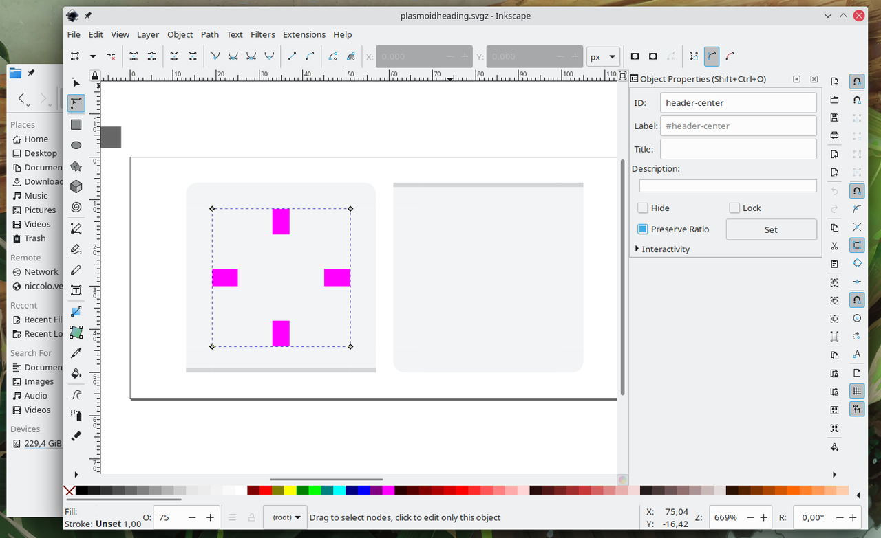
For plasmoid creators, all you have to do to use this new component is to use the PlasmaExtras.PlasmoidHeading{...} element. If you want it to be a footer, use location: PlasmaExtras.PlasmoidHeading.Location.Header
5.21
5.21 will see the introduction of Margin Areas. Similarly to Cinnamon, different areas of your panel can now have different margins:
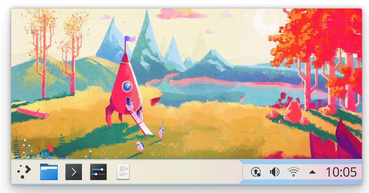
The rationale of this feature is simple; this allows for having consistent icon size within the left side of the panel and the right one without having giant system tray icons or small task manager ones. However, this features allows for so much more.
There's a new widget called the Margins Separator. This will effectively separate the “big margins” area of your panel from the “small margin” one. You can move this widget in your panel to decide what is going to have a big or small icon. You can also remove the widget to get rid of the feature entirely. Finally, you can actually add more than one Margin Separator in the panel; this will toggle small/big margins multiple times in a single time:

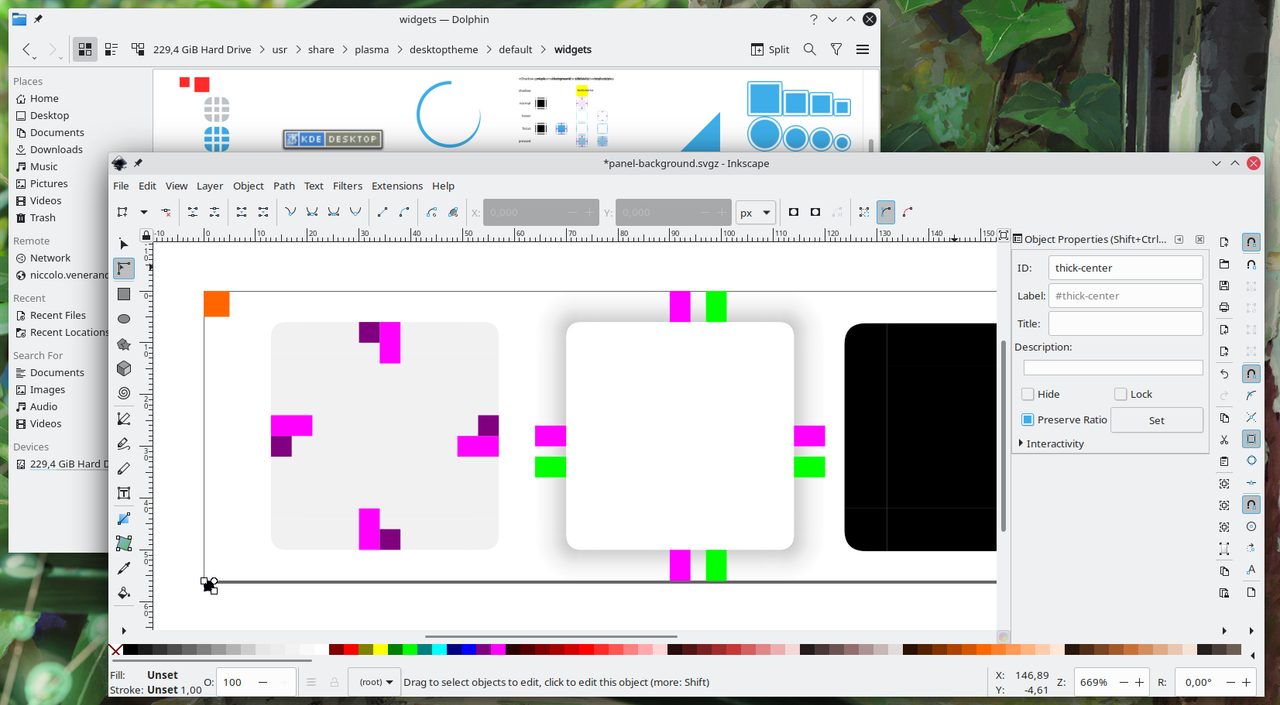
This is slightly more complex on the Themer side. Usually panel margins are taken from the hint-*-margin size in the widgets/panel-background.svg file. To enable this feature, do a clone of those margins and modify the cloned ones to be larger as you please. Then, add thick- to the id and label of the cloned elements, so that they are thick-hint-*-margin. Done that, create a new element with thick-center as the id. Disregard its color or shape; it only needs to exist in the svg.
The result should look like this:
5.22
Okay, fair enough, 5.22 is nowhere near being released, nor existing. However, I almost finished another sweet feature that won't make it into 5.21; it will probably land in 5.22. Let me go ahead of myself and explain it already.
Transparent panels can now become opaque dynamically, when a window is maximized. I will soon upload a youtube video to my currently empty channel to demonstrate this feature, so mAKE SuRE TO SuBsCriBE So tHaT yOu DOn'T MIss IT.
This one is the easiest to adopt for Themers. Just add these lines in your metadata.desktop file:
[AdaptiveTransparency]
enabled=true
wew, that was hard. If you want to customize the look of the opaque panel, create a solid/widgets/panel-background.svg file containing the opaque panel. However, please keep in mind that this feature has not landed yet and this last part is still subject to changes.
Users can decide if they want each of their panel to be opaque, always transparent or adaptive in the panel system settings.
5.23
Ahah, just kidding. I'll take this blogpost as an occasion to explain plans for the future. The next feature I'd like to work on for theme makers is the ability to make floating panel and widgets. This would be done by creating a new margin called outer-hint-*-margin (similarly to what is explained in the 5.21 section) in widgets/panel-background.svg and/or dialog/background.svg. This would probably be off by default but I think there could be a user-facing option to turn it on.
