 The Blind Spots In My Life (Blast from the Past IV)

I'm a Lecturer in Computer Science at Brunel University London. I teach games and research simulations. Views are my own :).
The Blind Spots In My Life (Blast from the Past IV)
Small Sims 11: The Epidemiological model

Having reviewed a pile of epidemiological models, and worked on a detailed one myself, it seems long overdue to write a Small Sims post about epidemiological modelling.
The Flu And Coronavirus Simulator we worked on is a bit too extensive to cover in Small Sims, so instead I'll focus on a much simpler model: the so-called SIR model. Here SIR stands for Susceptible, Infectious and Recovered.
Although a lot of advanced articles cover these models, the SIR model itself is actually remarkably simple. As you will find below, we need a lot less code here than for many other Small Sims installments :).
Our platform of choice today is repl.it, where you can create simple Python code fragments and run them.
Without further ado, let's get started!
First we need to import a few libraries so we can plot stuff:
import matplotlib.pyplot as plt
import matplotlib as mpl
mpl.use('Agg')
Next, we create our population. 998 people are healthy:
S = [998]
Two people are ill and infectious:
I = [2]
And nobody has recovered (yet):
R = [0]
The following variable, beta, indicates the speed that the disease will spread. I picked 0.3, just so that you get a nice-looking graph over 100 time steps:
beta = 0.3
And gamma is the chance of an ill person to recover. A gamma of 0.12 indicates that a person has ill for 1/0.12=8.33 days on average:
gamma = 0.12
Now the magic is of course not in this starting state, but in how you progress from one state to the next! We do this using a step function:
def Step():
Here, the number of newly infectious people (new_I) is equal to the number of people currently susceptible (S[-1]) times the number of currently infectious (I[-1]), times beta and divided by the total population size (1000).
new_I = beta*S[-1]*I[-1]/1000
Meanwhile, the number of newly recovered people is the number of currently infectious people times gamma:
new_R = gamma*I[-1]
We then subtract the newly infectious people from the susceptible population (allowing for fractions, btw ;)):
S.append(S[-1] - new_I)
and add them to the number of infectious people. In turn, we subtract the number of newly recovered people from the infectious population:
I.append(I[-1] - new_R + new_I)
...and add those to the recovered population!
R.append(R[-1] + new_R)
Five lines: that's literally all the logic we need for a basic model!
Last task is of course to run the simulation and generate the graph. You can do this as follows:
First print the initial state as a reference:
print(S[-1],I[-1],R[-1])
Next, run the simulation for a hundred steps, and print the three populations after every step:
for i in range(0,100):
Step()
print(S[-1],I[-1],R[-1])
And finally, let's make ourselves a simple plot and write it to a png file!
fig, ax = plt.subplots()
ax.plot(S, label="Susceptible")
ax.plot(I, label="Infectious")
ax.plot(R, label="Recovered")
ax.grid()
ax.legend()
fig.savefig("SIR.png")
When you run this code, and then open SIR.png, you'll see something like this:
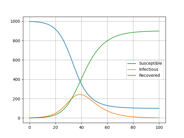
Here you can see the time in days on the x axis, and the number of people in each category on the y axis!
And that's all we need really! You can find the Repl.it just below, which allows you to run the thing straight from your browser and double-check the code. Feel free to have a play with the code, and I particularly recommend playing around with the beta values, the gamma values, and the size of the initial population :).
Oh, and if you're keen to check out the other installments of Small Sims, please have a look at the index here.
And for subscribers, I am going the full stretch today by extending the SIR into SEIRD :).
A week of Covid-19 modelling

Two things happened this week:
I might elaborate on both of them a bit more about a later stage, but I just wanted to sign-post them for you all today :).
I also got a few questions about both along the way, and thought I'd use this blog post to summarize the answers for everyone's interest. I will be sure to update these post with new answers whenever I get new questions about these topics :).
“Does your model treat each burough as a closed system? That is, does it assume that all residents will stay within the borders, and no non residents will enter?”
- Yes, the model is a closed system, but it is possible to put in a background transmission rate to reflect infections coming from outside.
“The line graphs for each scenario looked very similar between buroughs. Is that indeed the case?”
- There are clear differences, but in North West London the precise differences are indeed not enormous. When you look closely, you can see important differences in the height of the initial peak though, and when a second, slower wave is expected to peak.
“Finally, have you looked at applying the model anywhere else? If I understand the toolkit, it should be easy to apply to other cities?”
- We are already trying out the model on 4 other boroughs in London, and we are preparing for the code to be reused in other cities. The code can be re-used for any local region, except for ones where the necessary OpenStreetMap data is missing or when a region is too large to simulate (more than ~1M household). If a region is too large, it is possible to split it into multiple simulations though. Also, we hope to develop a more efficient parallel version that can cope with larger regions.
“Is there any kind of “feature selection” in your model? That is, of the social gathering spots you looked at, can you see which geographical features make a borough especially vulnerable?”
- The feature selection is relevant actually, because every spot is different. Its location determines which households go there, and the number of square meters can affect how likely the infection is to spread there.
“Do such models [like FACS] give possible answers to some of the questions why some events have been shown to be spreading events, and others haven't? There seem to be multiple cases of choir practice reported as spreaders, but not the CPC run for instance.”
- No, the FACS model is currently too coarse-grained for that. To really identify superspreader events, you'll probably need data on the ventilation and cleaning regime in a given location and to more precisely figure out what people do in such a place (e.g., do they exercise, how much do they talk etc.).
“Is there a difference between [the generative model you've reviewed] and “agent-based” models?”
- Yes, very much so. This is a mean-field model, so it models probabilities over a population without resolving individual behaviors, while an agent-based model (usually) models individuals explicitly. An example of an agent-based model is the model used in Imperial Report 9, or the FACS model that we just wrote a paper about :).
Credits
Header image courtesy of the FACS paper.
Generating Tile Images II (GameWorld 11)

It's a big gap, but GameWorld is back! (at least for now ;)).
Last time, we started with making plain tiles, as well as basic grid and brick structures. Today, I am going to extend this with 3+1 extras:
We are using the same approach as last time (I do recommend doing that tutorial first), but extend it with a few new routines.
Because several of the shapes need shadows and highlights to give them a 3D look, we start of with making a simple function that creates shadow and highlight color, given a default starting color.
Here is the function to make a shading color, which we put in tile_patterns.py:
def shade(rgb, intensity=2):
tmp = [0,0,0]
for i in range(0, len(rgb)):
tmp[i] = int(rgb[i]/intensity)
return tmp[0],tmp[1],tmp[2]
Simply put, I define a shadow as a color with half of the values of the regular color. And for highlights, I do the opposite, which looks like this:
def highlight(rgb, intensity=2):
tmp = [0,0,0]
for i in range(0, len(rgb)):
tmp[i] = min(255, int(rgb[i]*intensity))
return tmp[0],tmp[1],tmp[2]
Now, to make a sphere with highlight and shading, we first need to make a circle. This you can do as follows:
def draw_circle(t, i, color, xc, yc, xc2, yc2):
d,x,y,tw,th = t.get_properties(i)
d.ellipse([x+xc,y+yc,x+xc2,y+yc2],color)
In my simplistic tutorial, I simply make a ball by placing three circles at on top of each other, each with a size and a position that helps convey some depth. This looks as follows:
def draw_ball(t, i, hcolor, color, lcolor, xc, yc, xc2, yc2):
w = xc2-xc
h = yc2-yc
draw_circle(t, i, lcolor, xc, yc, xc2, yc2)
draw_circle(t, i, color, int(xc+w/20), int(yc+h/20), int(xc2-w/8), int(yc2-h/8))
draw_circle(t, i, hcolor, int(xc+w/7), int(yc+h/7), int(xc+w/2.5), int(yc+h/2.5))
Here, lcolor is the shadow color, which is used for the biggest background circle. I then put a slightly smaller circle on top of that, aligned to the top left, with the default color. Lastly, I add a small circle with the highlight color (hcolor) in the top left area of the main circle, to indicate a highlighted region. Combined, this will make a ball roughly like this:

Now, be aware that there are much better ways to do this, but I went straight for simplicity here.
Similarly, we can add shading and highlights to rectangles. This we can do as follows:
def draw_3drect(t, i, color, x1, y1, w, h):
rgb = ImageColor.getrgb(color)
w -= 1
h -= 1
d,x,y,tw,th = t.get_properties(i)
We first decide on the size of the shaded and highlighted region, which corresponds to the depth of the rectangle. I chose a ratio of 0.1.
shade_size = 0.1
shade_width = max(1,int(shade_size*w))
shade_height = max(1,int(shade_size*h))
hl_size = 0.1
hl_width = max(1,int(hl_size*w))
hl_height = max(1,int(hl_size*h))
Next we draw the main rectangle (everything else will come on top of it)
draw_rect_hwrap(t, i, color, x1, y1, w, h)
And on the right side and the bottom side, two shaded rectangles:
draw_rect_hwrap(t, i, shade(rgb), (x1+w-shade_width)%tw, y1+hl_height, shade_width, h)
draw_rect_hwrap(t, i, shade(rgb), x1+hl_width, y1+h-shade_height, w-hl_width, shade_height)
Lastly, we draw two highlight rectangles on the left and on the top.
draw_rect_hwrap(t, i, highlight(rgb), x1, y1, hl_width, h-shade_height)
draw_rect_hwrap(t, i, highlight(rgb), x1, y1,w-shade_width, hl_height)
Note that I am using a function called “draw_rect_hwrap() here, which I am about to explain :).
To make 3D bricks, we first need 3D rectangles representing each brick. But to make the pattern repeating, we also need those rectangles to wrap properly around the sides of the tile. To do this, we need a special version of draw_rect() which is used in the same way, but wraps around the sides. That one looks like this:
def draw_rect_hwrap(t, i, color, x1, y1, w, h):
d,x,y,tw,th = t.get_properties(i)
if x1+w>tw:
draw_rect(t, i, color, x1, y1, tw-x1, h)
draw_rect(t, i, color, 0, y1, x1+w-tw, h)
else:
draw_rect(t, i, color, x1, y1, w, h)
Now the next step, is to simply place the rectangles side by side, with alternating offsets so that we get a brick pattern. We do that like this:
def draw_3dbrick(t, i, color="#900", width=24, height=12):
d,x,y,tw,th = t.get_properties(i)
row = 0
b = 0
a = 0
while b < th:
while a < tw:
draw_3drect(t, i, "#A22", a, b, width, height)
a += width
b += height
row += 1
a = int(((width)/2) * (row%2))
..and once we do that, we can make a brick like this:

There are a *lot* of ways to make a tree, but a simple one is to simply use a brown stick, and put on it a pattern of green balls. Here's what that looks like in code:
def draw_tree(t, i, hcolor="#4f4", color="#0a0", lcolor="#060"):
d,x,y,tw,th = t.get_properties(i)
d.rectangle([x+20, y+24, x+28, y+48], "#660")
The next line contains all the coordinate pairs where we place the green spheres:
for xy in [[8,9],[18,4],[27,10],[6,19],[20,14],[28,10],[18,24],[28,19]]:
draw_ball(t, i, hcolor, color, lcolor, xy[0], xy[1], xy[0]+16, xy[1]+16)
And when you use this, you get a simple tree like this!

It's all very simple stuff still, but I think you get the idea: with each simple drawing function that combines existing drawing functions, we're able to add a little more variety and depth to our tile graphics.
I've added the Repl in the Appendix, and I extended the tile demonstrations, which now look like this:

And the functions to make the last 5 tiles are as follows in main.py:
tp.draw_circle(t, 12, "#DD3", 0, 0, 47, 47)
tp.draw_ball(t, 13, "#FF6","#DD3", "#AA2", 0, 0, 47, 47)
tp.draw_tree(t, 14, "#4f4","#0a0", "#060")
tp.draw_dog(t, 15)
tp.draw_3dbrick(t, 16, "#A22")
Who knows what we'll focus on next? Perhaps it's even more advanced tiles, or perhaps something entirely different....
You can find the online runnable Repl.it here: https://repl.it/@djgroen/Gameworld-10-Tile-Generator-II#tile_patterns.py
Covid19 Lockdown: what is wrong & what is weird

Lockdown has been lasting for a long time, and myths have filled the internet all over the place. Today I want to try and dispel a few of those myths, but also point out some things that are happening, but also very weird when you start thinking about them.
I'm sorry everyone, but the results are in, and disprove this completely. Trump's medicine increases the chance of dying by a third on average, and also causes heart arrhythmia as a major complication in many patients. Many of Trump's statements are open for multiple interpretations, but in this case there is no ambiguity. He is taking the medication himself, and is a fool for doing so.
We can now also safely say that this one is wrong. Many groups have now tested for anti-bodies, and even in hard-hit states like France and Spain only 5% of people appear to have been infected: https://twitter.com/EricTopol/status/1260666412164542465
In *very* hard hit cities like New York, the percentage may be as high as 20%, but even that is only a small minority of the population.
A rough and incomplete overview of various tests can be found here: https://docs.google.com/spreadsheets/d/17Tf1Ln9VuE5ovpnhLRBJH-33L5KRaiB3NhvaiF3hWC0/edit#gid=0
Various websites like Worldometers and Ourworldindata give exact numbers on how many cases have been confirmed and how many deaths are confirmed. Meanwhile, the Financial Times is tracking how many more people are dying than normally around this time of year. Now, first of all all three of these sources are reporting very different numbers, with the Financial Times often reporting the highest numbers.
But the sad thing is that even the Financial Times is underestimating the deaths. For instance, let's look at the graph in that article today, on May 23rd:

The numbers look pretty dramatic here. For instance, the FT reports 8,900 excess deaths in the Netherlands, while Worldometers reports about 5,800 deaths from Covid-19.
But if you look even more closely, you'll find that the little excess death graph from the FT ends on... April 26th, almost a month ago.
Likewise, for the US it reports 52,300 deaths on April 18th, and on that same day Worldometers reported about 40,000 deaths. Today, worldometers is reporting about 98,000 deaths in the US, but given the previous discrepancy with the FT data, I would argue that 130,000 is probably a more realistic estimate.
To further compound this incredible mess, there are almost certainly countries out there that deliberately underreport their deaths.
Yes, I fell for this one as well. But it doesn't stand up to serious scrutiny really.
Having dispelled some myths, I now would like to cover a few things that are just plain weird; things we should be reconsidering.
For two months now, my daughter is doing online zoom classes about ballet, singing, acting, and she even got offers to do online karate. Yet, when it comes to actual school, there are no such online streaming sessions, and pretty much the whole of the UK has to do with weekly homeschooling workload e-mails.
I understand that afterschool clubs provide online classes simply because they might go out of business otherwise (and schools do not), but isn't this whole situation getting a little bit ridiculous?
As a reminder, the reproduction rate R is the average number of people that a given patient will infect on average. A number less than 1 indicates that, on average, an epidemic fizzles out, and a number greater than 1 indicates that it is growing.
I am not fundamentally against measuring epidemics in this way, but it is painful to see how R gets completely misused by just about everyone. Allow me to indulge on listing the sins.
1. Politicians are telling us that an R lower than one means we're doing well. There is a very simple counterpoint to make here: the easiest way to get a low R on the short term is to do far too little testing. And that is exactly what happened during this pandemic.
2. Modellers are putting R as an input parameters in their model, but also reporting R as an output. The Kucinskas code is just one example of it, but modellers are doing it just about anywhere. This can be dangerous, because it means that any error in your initial estimation of R immediately passes on as errors in your model outputs. Also, there is just something fundamentally weird about putting a measure as input and then producing it as an output, it feels a bit like second-serving food in a restaurant...
3. The community has cheerfully abandoned much simpler measures in favor of “R”
At the start of the pandemic, people still spoke about doubling times, or the percentage growth per day or week of the number of affected cases or deaths. All these measures are simpler and more intuitive than this R number. But some I suppose the magical “R” number makes for more appealing article titles?
The S&P 500 is actually at a higher point than it was a year ago, even though 38 million people (and counting...) have been laid off:

S&P 500 index over the last year. From Google Search.
I cannot begin to fathom what warped logic drives this perception of the future business potential in the US.
Header image courtesy of Marco Verch.
Oh, and a last thing popped up for the subscribers:
Time for something very different :)

Here's a small discovery I made while in self-isolation: drum tutorials!
A good friend of mine (Rob Pennel) is a professional drum teacher, and he has been sharing very minimalistic, but effective drumming tutorials for kids online. Because I think they're really cool and I have his permission to share them, I am going to post them here as they're very quick and effective (<5 minutes per lesson).
I enjoyed doing them with Eos, perhaps you find them fun too?
Lesson 1 – Simple rhythm
Lesson 2 – Simple phonics, 2:4 rhythm
Lesson 3 – Simple rhythm times
Lesson 4 – Simple phonics, 4:4 rhythm
Time will tell whether a fifth lesson will emerge :).
This unexpected edition has been brought to you by... my wife:
So yes, the pressure is indeed on now!
This particular model has been published on SSRN (a non-peer reviewed preprint platform, see the paper here), and is currently doing the rounds on Twitter.
The model essentially aims to estimate the R value, which is the number of people that will be infected by the infectious population, divided by the size of the infectious population itself.
So in the case of R=1, each infected individual will infect exactly 1 other person on average, and the number of infected people remains the same over time. An R value of greater than 1 implies an epidemic that grows, and an R value of less than 1 implies an epidemic that reduces in size over time, as more people recover.
Now Simon Kucinskas aims to estimate the value of R, using assumptions from a so-called SIR (susceptible-infectious-recovered) model, in conjunction with a technique called Kalman filtering (I won't go into detail on that now, but Wikipedia has a good piece on it here).
The author essentially claims the following two things in the abstract:
1. “We develop a new method for estimating the effective reproduction number of an infectious disease ® and apply it to track the dynamics of COVID-19.”
2. “The method is very easy to apply in practice, and it performs well even when the number of infected individuals is imperfectly measured, or the infection does not follow the SIR model.”
But wait, there is a little bit more here. The author “had something to say” on Twitter via this short Tweet exchange:

Since Twitter is public, and as peer-reviewed as the article itself (i.e. not yet until now ;)), I will include this Tweet as another claim.
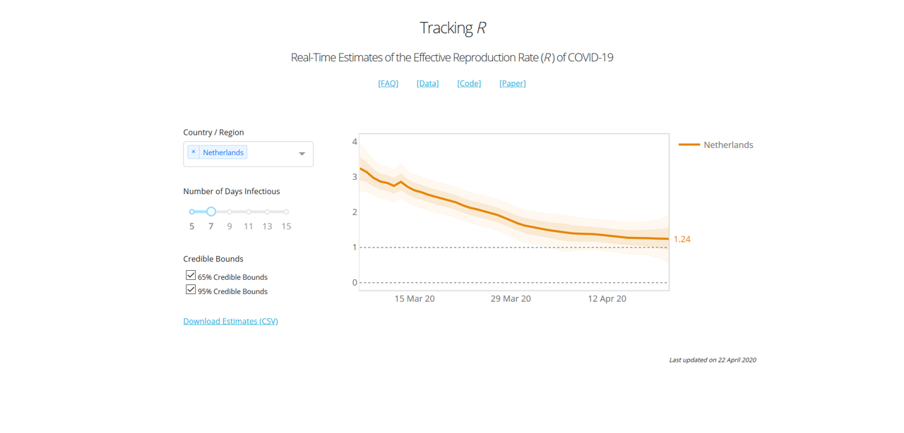
To give you an idea of what the model looks like, he has been so kind to share his model code (here), and provide an online dashboard here. Here is what the curve looks like for the UK for instance:

In the case of the UK, we essentially had a 2+-stage lockdown by the way: On March 16th the government imposed (among other things) social distancing, case isolation, household isolation, encouraged working from home and closed a first range of facilities. Next, on March 23rd the lockdown was tightened by closing schools, a range of shops and leisure facilities, and a stronger directive to work from home. Even in mid-April supermarkets were still being rearranged and park gates closed near my house.
According to this graph, the two measures introduced a very gradual decrease of R0, towards the value of 1.82 at the day of viewing (April 21st).
A last claim from the article is a table with main results:

Here he provides a summary of his estimates of the change of R when introducing a range of public health interventions, including schools closures, self isolation, cancelling public events, and a “lockdown”. The definition of these measures is taken from Imperial Report 13, another modelling report from Imperial that I haven't reviewed (yet) :).
His own interpretation of these results is that:
the graph shows that R is also on a downwards trend before the lockdown. In particular, there does not appear to be a visually detectible break in the trend at the date of the lockdown (i.e., there is no “kink” after the introduction of a lockdown). In the Appendix, we show that a similar pattern is observed for the remaining types of NPIs studied by Flaxman et al. (2020a).
This comment implies, at least to me, that a lockdown would not have been necessary, and that the epidemic would have flattened out in any case.
In the review, we cover four areas (as mentioned before) in order: Robustness, Completeness, Quality of Claim, and Presentation. I maintain this order, because the last one is pointless if the first one isn't there, and the third one is not a total disaster if the underlying model is at least of some use. So let's have a look at the
To construct the model, the author relies on data from this CSV file. The key statistics he uses are measurement of new cases, new deaths and new recoveries. The author notes that this data has shortcomings (it definitely does), and then proceeds to apply techniques to try and mitigate this (which is helpful to some extent).
However, he also takes a range of interventions that were originally presented in Imperial Report 13, and that is where things begin to get wonkier. In that particular report, the authors the following about their definition of the interventions:
We have tried to create consistent definitions of all interventions and document details of this in Appendix 8.6. However, invariably there will be differences from country to country in the strength of their intervention – for example, most countries have banned gatherings of more than 2 people when implementing a lockdown, whereas in Sweden the government only banned gatherings of more than 10 people. These differences can skew impacts in countries with very little data. We believe* that our uncertainty to some degree can cover these differences, and as more data become available, coefficients should become more reliable.
Now, without going through the whole of Appendix 8.6 of Imperial Report 13 (I'm sure you all appreciate I'd like to keep this blog post vaguely readable ;)), I think most of you will realize quite well that the lockdown measures varied per country. But there is another, more important aspect here: most countries did not go into lockdown instantly. Like I mentioned in the case of the UK above, the lockdown there had at least two distinct stages in terms of implementation (March 16th and 23rd), and in practice there was a very gradual trend towards providing more pressure to stay at home (with further park closures and supermarket rearrangements even after the lockdown was in place). And when we get to a country like the US, where lockdowns have been enacted state-by-state, things get even more complicated.
In this paper, the author assumes an instant lockdown at a single time point, and then fails to find a kink in the graph, but instead a gradual decrease. And this result makes perfect sense, once you realize that a lockdown has not been instant anywhere, but gradual...
But the model does get a lot wonkier than that. Let's look at the R0 of the whole world:

I take an infectious duration of 13 days, because to my knowledge an average infection duration of that length is most commonly reported in the literature.
Now according to this result, the R number of Covid-19 in the world on the 29th of January was a whopping 6.57. This is simply not possible, because it is well outside of the range of all the literature estimates of R/R0 that I have come across, which mostly are in the range of 2 to 3, and which I discussed in my previous review. The lower bound of the 95% confidence interval resides around 5.4, which is higher than 100% of all the R numbers I have ever found in empirical assessments of Covid-19 in the papers (but please do correct my if I'm wrong).
So what is happening there then? Well, most likely the model is skewed due to the fact that Covid-19 cases were highly underreported earlier in January (especially in Italy). So, despite the wide range of measures the author has taken to make his model robust against data issues, the most simple aggregated metric (R value of the world) is already caving in at the start of the modelling period(!)
Robustness rating: 1.5/5. The paper claims to have a model that is robust against data issues, but delivers very unrealistic estimates for the most aggregated set of countries (the world) at the start of the modelling period (-1.5 points). The paper also claims to systematically assess the effect of interventions, but the definitions of those interventions are on shaky ground because they're assumed to be (1) instant, and (2) uniform across a wide range of different countries, which they are not (-1 point). The underlying approach has potential, but the author has unfortunately distorted far too many aspects of the problem for this to be anywhere close to robust. Lastly, the extensive use of p-values and confidence intervals imply that reality is very likely to reside within these bounds. However, these intervals are all statistical, and do not reflect the much larger uncertainty and bias that surrounds the assumptions of the model and the quality of the collected data (-1 points). In summary, this model has major robustness issues.
Okay, so the model wasn't a success in terms of robustness, but how complete is it? To judge this fairly, we have to realize that this model is meant for calculating the reproduction number for countries, or collections of countries, and that its design is deliberately simple.
The model covers all countries, takes cases, deaths and recoveries as data, and in that particular area I would consider it to be reasonably complete, given its simplistic approach. A lot of issues discussed earlier are caused by the underlying data (which the model isn't robust against, despite some statistical wizardry), and not so much by the approach itself.
Where the model is clearly incomplete is in its implementation and assessment of the different public health measures. As mentioned before, these are greatly simplified, and to the extent that they greatly distort the outcomes of the model
When looking at the data on the country level, we see huge differences in the way the epidemic progresses, and huge variety in how local effects distort the curves (look for example at cases such as Singapore, where a peak is emerging due to housing-related issues of migrants).
Indeed, it is a fair question to ask whether a simplistic model like this is complete enough to be of use for any particular country.
Completeness: 2.5/5. Here I look at the model, not the claims around it. The model has a very high-level scope, and the infection data is incorporated systematically. However, the implementation of public health measures in the model is overly simplistic, and distorts the results greatly (-2 points). In addition, the model operates at such a high level that one can credibly doubt whether it is detailed enough in general to be useful (-0.5 point).
Okay, there is a lot to go through here. So let's take the claims one by one:
1. “We develop a new method for estimating the effective reproduction number of an infectious disease ® and apply it to track the dynamics of COVID-19.
The first part is correct, but the second part is a generous claim. The dynamics of Covid-19 extend far beyond simply estimating a reproduction number over time.
2. “The method is very easy to apply in practice, and it performs well even when the number of infected individuals is imperfectly measured, or the infection does not follow the SIR model.”
This claim absolutely doesn't hold (see Robustness section), so it is dangerous to make it.
3. The tweet I placed above, and that you can find here: https://twitter.com/simas_kucinskas/status/1252888724419026945
Here he claims that “This is how R looks like around the introduction of #COVIDー19 lockdowns in 13 European countries”. This statement is far too strong, and therefore simply wrong. The lockdowns are oversimplified, and the R estimate is based on data that has a lot of fundamental issues. Indeed, the lack of robustness of the regressions makes the result very unreliable, and also the confidence intervals do not represent the true uncertainty and bias around the result.
4. The results table and this claim: “the graph shows that R is also on a downwards trend before the lockdown. In particular, there does not appear to be a visually detectible break in the trend at the date of the lockdown (i.e., there is no “kink” after the introduction of a lockdown). In the Appendix, we show that a similar pattern is observed for the remaining types of NPIs studied by Flaxman et al. (2020a).”
The claim is technically true (there is no kink). However, the way measures (NPIs) are regressed and implemented is so coarse that one could reasonably expect a smoothed curve irrespective of the actual underlying situation. It's therefore not of much value to the reader.
Quality of Claim: 1.25/5. Two claims are completely wrong, and two claims are sort of in the gray area of half-true/half-useful. So a score of 1.25 out of 5 seems appropriate here.
So is this all bad then? Well, actually the author did a really good job in this area. He provides an online dashboard that people can use (see here), shares the code AND the key input data, and even documents about a range of issues and constraints both in the paper and in an online FAQ. The paper itself is relatively readable, given its technical nature, and the online dashboard functions well.
Especially, sharing the code is an important plus, especially since other, more prominent groups have failed to do so.
The interface of the online dashboard is a bit limited, as I would like to switch between measures, for example. But that is a relatively small detail.
Presentation: 4.5/5. Solid open science, clearly written and a well-functioning (though slightly minimal in terms of features) online dashboard. Overall a solid effort!
The overall picture looks like this:

Oh dear, the quality of claim score is so low that the arrowhead turned upside down! Needless to say, the model is replete with issues and the claims dangerously flawed, but at least it's open source, and with a good dashboard.
Copy and reuse the dashboard, ignore the rest.
Please do not oversell your work like that again.
To my knowledge, I have no conflict of interest with the author of this report. I do, however, have a role in two ongoing EU projects on simulation: one of which focuses on simulating global challenges (HiDALGO), and one that focuses on verification, validation, uncertainty quantification and sensitivity analysis (VECMA). In addition, I do work on a local level model for Covid-19 spread (this is still in progress). For any questions or comments please feel free to contact me on Twitter (@whydoitweet). Like all content on this blog, unless indicated otherwise any content I produced can be freely shared.
Lastly, please note that I made this review as a best effort exercise from my personal perspective. It is likely to contain a few mistakes, inaccuracies and misinterpretations, which I am happy to correct once I'm aware of them.
*note: when scientists write “we believe”, you can safely assume that they're starting to make claims on shaky ground. After all, if there was any rock-solid evidence there, they would have given it to you on a silver platter right there! The vagueness of the statements right after are further red flags by the way, even in that (relatively rigorous) Imperial Report.
2 weeks of self isolation


The chances that the answer is 42 is about one in a million.
...but the question is important to me, because I needed to crack this one to validate the Covid-19 model I'm developing.
First of all, any model needs to be validated before you can even consider relying it. Validation literally is:
- The action of checking or proving the validity or accuracy of something.
In the case of simulation, you normally do this by comparing your results against data after a given time period, given some starting position.
When modelling Covid-19, the first data point to pop on the radar will be a patient that is hospitalised, and that tests positive for Covid-19. These hospitalisations are important to track for medical / public health purposes, but they also provide modellers with a starting point (the day with first hospitalisation(s)) and a range of data to validate against (subsequent days where the hospitalisations are counted).
Simply put, some countries test a lot more than others (see last column here). In fact, the differences in the amount of testing are so enormous across countries and over time, that it's hard to rely on that as a good baseline.
However, critically ill patients end up hospitalised in a large number of cases (they should be hospitalised in all cases, but I'm not totally sure that's happening...:/). So my line of reasoning is that the variation there will at least be smaller.

Source: *needpix.com*.
What does that mean? First of all, apparently 6.1% of the patients end up hospitalised on the intensive care. Also, patients are apparently hospitalised after 11 days on average.
These numbers may be some way off the real numbers, but this is the best data evidence I could find around today. So, let's go ahead and think about what this really means.
Essentially, if one patient ends up on the intensive care today, then it means that that patient got infected (on average) 11 days ago. But since that patient also represents 6.1% of all cases (again, on average), it also means that approximately 17 people got infected with Covid-19 11 days ago.
So we have 17 patients 11 days ago, but in my case I want a simulation that starts today. So my next step is to let society do its things for 11 days, and see what the situation is like.
Today, the effect might not be so dramatic, because measures such as social distancing, working from home and shop & school closures all help reduce the rate of spreading. But at the start of the epidemic every patient was infecting about 2.4 other people before recovering after approximately 14 days.
So the calculation we then make is:
17 * 2.4^(11/14) = ~34 patients on day 11.
(again, this number will be lower when lockdown measures are in place)
So as far as I can tell, one intensive care arrival of a Covid-19 patient at the start of an epidemic means that there are approximately 33 other patients walking around today. As the knowledge advances, we may learning that the true number will be higher or lower than that. But for sure it will be more than one.
How is this useful for my simulation building? Well, basically I start my simulation at the first intensive care arrival, then turn the clock back 11 days, put in 17 patients instead of one, and then start the simulation, simulating 11 days of spread before I begin to compare any results with the hospitalisation data available. I am then likely to end up with 34 patients in a simulation after those 11 days (if there is no lockdown), but there is a remote (one in a million?) chance that I'd end up with 42 l).
The main purpose of this post is to show you how intricate even something seemingly simple like validating a model against a measurement can be. And if there is anything you take home from this post, it's two things:
Header image by Glyn Baker / Southend University Hospital / CC BY-SA 2.0.
Under the Radar: Three weeks of Covid

.jpg)