COVID-19 Simulation Review Bonanza 4: The Kucinskas Method
This unexpected edition has been brought to you by... my wife:
So yes, the pressure is indeed on now!
This particular model has been published on SSRN (a non-peer reviewed preprint platform, see the paper here), and is currently doing the rounds on Twitter.
The Aim: calculate the reproduction number R
The model essentially aims to estimate the R value, which is the number of people that will be infected by the infectious population, divided by the size of the infectious population itself.
So in the case of R=1, each infected individual will infect exactly 1 other person on average, and the number of infected people remains the same over time. An R value of greater than 1 implies an epidemic that grows, and an R value of less than 1 implies an epidemic that reduces in size over time, as more people recover.
Now Simon Kucinskas aims to estimate the value of R, using assumptions from a so-called SIR (susceptible-infectious-recovered) model, in conjunction with a technique called Kalman filtering (I won't go into detail on that now, but Wikipedia has a good piece on it here).
The claims
The author essentially claims the following two things in the abstract:
1. “We develop a new method for estimating the effective reproduction number of an infectious disease ® and apply it to track the dynamics of COVID-19.”
2. “The method is very easy to apply in practice, and it performs well even when the number of infected individuals is imperfectly measured, or the infection does not follow the SIR model.”
But wait, there is a little bit more here. The author “had something to say” on Twitter via this short Tweet exchange:

Since Twitter is public, and as peer-reviewed as the article itself (i.e. not yet until now ;)), I will include this Tweet as another claim.
What it looks like
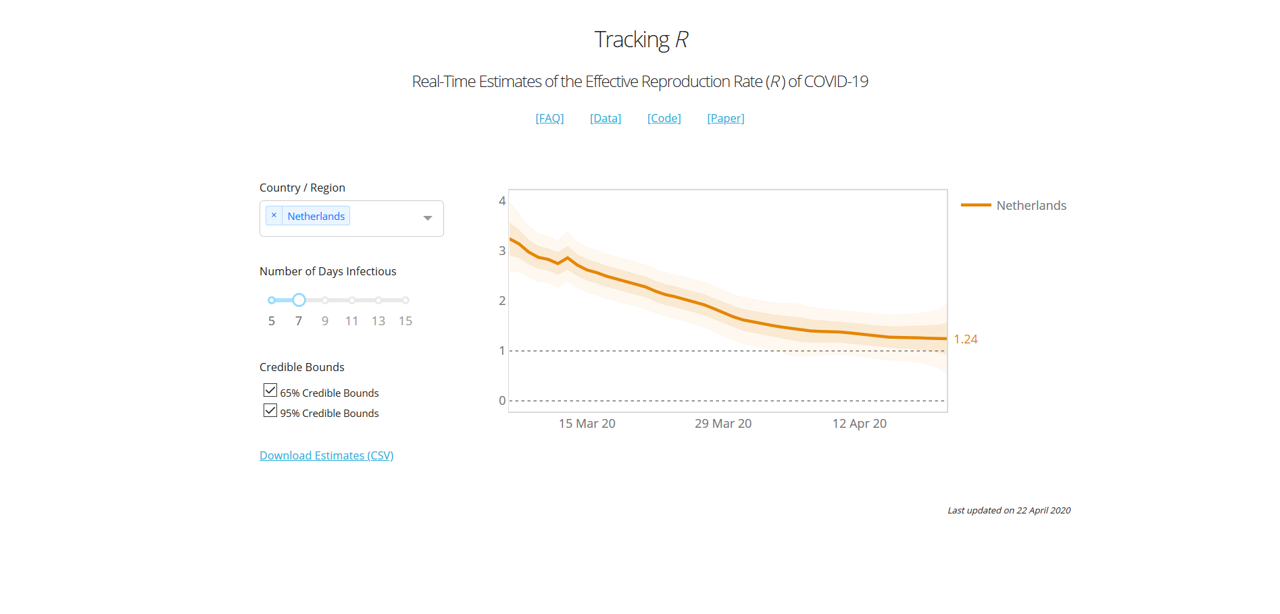
To give you an idea of what the model looks like, he has been so kind to share his model code (here), and provide an online dashboard here. Here is what the curve looks like for the UK for instance:

In the case of the UK, we essentially had a 2+-stage lockdown by the way: On March 16th the government imposed (among other things) social distancing, case isolation, household isolation, encouraged working from home and closed a first range of facilities. Next, on March 23rd the lockdown was tightened by closing schools, a range of shops and leisure facilities, and a stronger directive to work from home. Even in mid-April supermarkets were still being rearranged and park gates closed near my house.
According to this graph, the two measures introduced a very gradual decrease of R0, towards the value of 1.82 at the day of viewing (April 21st).
A last claim from the article is a table with main results:

Here he provides a summary of his estimates of the change of R when introducing a range of public health interventions, including schools closures, self isolation, cancelling public events, and a “lockdown”. The definition of these measures is taken from Imperial Report 13, another modelling report from Imperial that I haven't reviewed (yet) :).
His own interpretation of these results is that:
the graph shows that R is also on a downwards trend before the lockdown. In particular, there does not appear to be a visually detectible break in the trend at the date of the lockdown (i.e., there is no “kink” after the introduction of a lockdown). In the Appendix, we show that a similar pattern is observed for the remaining types of NPIs studied by Flaxman et al. (2020a).
This comment implies, at least to me, that a lockdown would not have been necessary, and that the epidemic would have flattened out in any case.
The Review
In the review, we cover four areas (as mentioned before) in order: Robustness, Completeness, Quality of Claim, and Presentation. I maintain this order, because the last one is pointless if the first one isn't there, and the third one is not a total disaster if the underlying model is at least of some use. So let's have a look at the
Robustness
To construct the model, the author relies on data from this CSV file. The key statistics he uses are measurement of new cases, new deaths and new recoveries. The author notes that this data has shortcomings (it definitely does), and then proceeds to apply techniques to try and mitigate this (which is helpful to some extent).
However, he also takes a range of interventions that were originally presented in Imperial Report 13, and that is where things begin to get wonkier. In that particular report, the authors the following about their definition of the interventions:
We have tried to create consistent definitions of all interventions and document details of this in Appendix 8.6. However, invariably there will be differences from country to country in the strength of their intervention – for example, most countries have banned gatherings of more than 2 people when implementing a lockdown, whereas in Sweden the government only banned gatherings of more than 10 people. These differences can skew impacts in countries with very little data. We believe* that our uncertainty to some degree can cover these differences, and as more data become available, coefficients should become more reliable.
Now, without going through the whole of Appendix 8.6 of Imperial Report 13 (I'm sure you all appreciate I'd like to keep this blog post vaguely readable ;)), I think most of you will realize quite well that the lockdown measures varied per country. But there is another, more important aspect here: most countries did not go into lockdown instantly. Like I mentioned in the case of the UK above, the lockdown there had at least two distinct stages in terms of implementation (March 16th and 23rd), and in practice there was a very gradual trend towards providing more pressure to stay at home (with further park closures and supermarket rearrangements even after the lockdown was in place). And when we get to a country like the US, where lockdowns have been enacted state-by-state, things get even more complicated.
In this paper, the author assumes an instant lockdown at a single time point, and then fails to find a kink in the graph, but instead a gradual decrease. And this result makes perfect sense, once you realize that a lockdown has not been instant anywhere, but gradual...
But the model does get a lot wonkier than that. Let's look at the R0 of the whole world:

I take an infectious duration of 13 days, because to my knowledge an average infection duration of that length is most commonly reported in the literature.
Now according to this result, the R number of Covid-19 in the world on the 29th of January was a whopping 6.57. This is simply not possible, because it is well outside of the range of all the literature estimates of R/R0 that I have come across, which mostly are in the range of 2 to 3, and which I discussed in my previous review. The lower bound of the 95% confidence interval resides around 5.4, which is higher than 100% of all the R numbers I have ever found in empirical assessments of Covid-19 in the papers (but please do correct my if I'm wrong).
So what is happening there then? Well, most likely the model is skewed due to the fact that Covid-19 cases were highly underreported earlier in January (especially in Italy). So, despite the wide range of measures the author has taken to make his model robust against data issues, the most simple aggregated metric (R value of the world) is already caving in at the start of the modelling period(!)
Robustness rating: 1.5/5. The paper claims to have a model that is robust against data issues, but delivers very unrealistic estimates for the most aggregated set of countries (the world) at the start of the modelling period (-1.5 points). The paper also claims to systematically assess the effect of interventions, but the definitions of those interventions are on shaky ground because they're assumed to be (1) instant, and (2) uniform across a wide range of different countries, which they are not (-1 point). The underlying approach has potential, but the author has unfortunately distorted far too many aspects of the problem for this to be anywhere close to robust. Lastly, the extensive use of p-values and confidence intervals imply that reality is very likely to reside within these bounds. However, these intervals are all statistical, and do not reflect the much larger uncertainty and bias that surrounds the assumptions of the model and the quality of the collected data (-1 points). In summary, this model has major robustness issues.
Completeness
Okay, so the model wasn't a success in terms of robustness, but how complete is it? To judge this fairly, we have to realize that this model is meant for calculating the reproduction number for countries, or collections of countries, and that its design is deliberately simple.
The model covers all countries, takes cases, deaths and recoveries as data, and in that particular area I would consider it to be reasonably complete, given its simplistic approach. A lot of issues discussed earlier are caused by the underlying data (which the model isn't robust against, despite some statistical wizardry), and not so much by the approach itself.
Where the model is clearly incomplete is in its implementation and assessment of the different public health measures. As mentioned before, these are greatly simplified, and to the extent that they greatly distort the outcomes of the model
When looking at the data on the country level, we see huge differences in the way the epidemic progresses, and huge variety in how local effects distort the curves (look for example at cases such as Singapore, where a peak is emerging due to housing-related issues of migrants).
Indeed, it is a fair question to ask whether a simplistic model like this is complete enough to be of use for any particular country.
Completeness: 2.5/5. Here I look at the model, not the claims around it. The model has a very high-level scope, and the infection data is incorporated systematically. However, the implementation of public health measures in the model is overly simplistic, and distorts the results greatly (-2 points). In addition, the model operates at such a high level that one can credibly doubt whether it is detailed enough in general to be useful (-0.5 point).
Quality of Claim
Okay, there is a lot to go through here. So let's take the claims one by one:
1. “We develop a new method for estimating the effective reproduction number of an infectious disease ® and apply it to track the dynamics of COVID-19.
The first part is correct, but the second part is a generous claim. The dynamics of Covid-19 extend far beyond simply estimating a reproduction number over time.
2. “The method is very easy to apply in practice, and it performs well even when the number of infected individuals is imperfectly measured, or the infection does not follow the SIR model.”
This claim absolutely doesn't hold (see Robustness section), so it is dangerous to make it.
3. The tweet I placed above, and that you can find here: https://twitter.com/simas_kucinskas/status/1252888724419026945
Here he claims that “This is how R looks like around the introduction of #COVIDー19 lockdowns in 13 European countries”. This statement is far too strong, and therefore simply wrong. The lockdowns are oversimplified, and the R estimate is based on data that has a lot of fundamental issues. Indeed, the lack of robustness of the regressions makes the result very unreliable, and also the confidence intervals do not represent the true uncertainty and bias around the result.
4. The results table and this claim: “the graph shows that R is also on a downwards trend before the lockdown. In particular, there does not appear to be a visually detectible break in the trend at the date of the lockdown (i.e., there is no “kink” after the introduction of a lockdown). In the Appendix, we show that a similar pattern is observed for the remaining types of NPIs studied by Flaxman et al. (2020a).”
The claim is technically true (there is no kink). However, the way measures (NPIs) are regressed and implemented is so coarse that one could reasonably expect a smoothed curve irrespective of the actual underlying situation. It's therefore not of much value to the reader.
Quality of Claim: 1.25/5. Two claims are completely wrong, and two claims are sort of in the gray area of half-true/half-useful. So a score of 1.25 out of 5 seems appropriate here.
Presentation
So is this all bad then? Well, actually the author did a really good job in this area. He provides an online dashboard that people can use (see here), shares the code AND the key input data, and even documents about a range of issues and constraints both in the paper and in an online FAQ. The paper itself is relatively readable, given its technical nature, and the online dashboard functions well.
Especially, sharing the code is an important plus, especially since other, more prominent groups have failed to do so.
The interface of the online dashboard is a bit limited, as I would like to switch between measures, for example. But that is a relatively small detail.
Presentation: 4.5/5. Solid open science, clearly written and a well-functioning (though slightly minimal in terms of features) online dashboard. Overall a solid effort!
Wrap up
The overall picture looks like this:

Oh dear, the quality of claim score is so low that the arrowhead turned upside down! Needless to say, the model is replete with issues and the claims dangerously flawed, but at least it's open source, and with a good dashboard.
RECOMMENDATION TO READERS
Copy and reuse the dashboard, ignore the rest.
RECOMMENDATION TO THE DEVELOPER
Please do not oversell your work like that again.
Disclaimer
To my knowledge, I have no conflict of interest with the author of this report. I do, however, have a role in two ongoing EU projects on simulation: one of which focuses on simulating global challenges (HiDALGO), and one that focuses on verification, validation, uncertainty quantification and sensitivity analysis (VECMA). In addition, I do work on a local level model for Covid-19 spread (this is still in progress). For any questions or comments please feel free to contact me on Twitter (@whydoitweet). Like all content on this blog, unless indicated otherwise any content I produced can be freely shared.
Lastly, please note that I made this review as a best effort exercise from my personal perspective. It is likely to contain a few mistakes, inaccuracies and misinterpretations, which I am happy to correct once I'm aware of them.
Footnotes
*note: when scientists write “we believe”, you can safely assume that they're starting to make claims on shaky ground. After all, if there was any rock-solid evidence there, they would have given it to you on a silver platter right there! The vagueness of the statements right after are further red flags by the way, even in that (relatively rigorous) Imperial Report.