KassArt

This one is about my art. Everything that can be done on a blank background will find it‘s way here. Stay tuned!

How to paint skin with blue, yellow and red colors without making it look unnatural? Get the values right! So I searched for a reference which has different skin colors according to lighting and on top of it I exaggerated my use of color. This excessive use of color gives the painting an artistic look and it is a great exercise for values. Value defines how much light hits the surface of your object or of your reference. In this case: parts which don't reflect much or any light have darker values. Parts which reflect more light have lighter values. So understand where the light is coming from and how the light meets the surface of your reference. This will create an illusion of three-dimensionality while you are painting on a flat piece of paper.

And here is the result!

https://www.cinnamon.video/watch?v=285230481954309562

This piece is just one step on my way of mastering portraits. I change the media and I want to be able to create different styles of art pieces. Follow me on my journey here on Coil and on Twitter!

https://twitter.com/KassjanS

I also made an additional video with my own thoughts on the painting process. I explain the techniques I was using and the challenges I faced. Unlock my bonus content to dive deeper into this kind of art.

Read more...

People who follow me know, that right now I am in the middle of making portraits. So what is this about? I am not leaving portraits yet – in fact I have already started a new one and I already like the way it is unfolding. Still I want to shorten the waiting time a bit by showing you a project I made weeks ago for a YouTube channel which was about to be created.

This project is right now on hold and it is not clear when or if this channel is going to be created. That is why I am allowed to reveal the design of the logo for this channel.

The channel was supposed to be a german car channel. The creator's thought of a name for this channel which combines cars and cameras. That's how they picked the name Autofokus. And this was also the inspiration for the logo. I replaced the lense of a camera with a wheel of a car.

I hope you like the result!

https://www.cinnamon.video/watch?v=276735589460477293

Unlock my subscriber content to find out about the equipment I used and which steps I was taking to make this logo!

Read more...

Next picture of my portrait-line. I was using a wet in wet technique to create nice blendings and combined it with colored pencils after the picture dried. With this piece I further wanted to study hair. I explain the techniques I used in my bonus content. This piece is just on step on my way of mastering portraits. I change the media and I want to be able to create different styles of art pieces. Follow me on my journey here on Coil and on Twitter!

https://twitter.com/KassjanS

And here is the video which shows in fast forward how I did it.

https://www.cinnamon.video/watch?v=275049257994553327

I also made an additional video with my own thoughts on the painting process. I explain the techniques I was using and the challenges I faced. Unlock my bonus content to dive deeper into this kind of art.

Read more...

A lamp is something everybody has, right? So lighting isn‘t something somebody thinks of when he or she is starting out painting.

Still it is so important.

The wrong light source can have a huge impact on the final result of your art piece. Wrongly positioned light sources can make the process of painting a lot harder: It can cast a shadow of your own hand on the exact spot where you want to paint or when you are recording your artwork like I do, the light source might do the perfect light for you to work, but it still could cause reflections into the the lense of the recording camera.

So I will split this post into two sections: Light source and light position

Light source:

First you have to ask yourself: Natural light or use a lamp?

Whenever you can use natural light – use it! It is the best light you can get. Just take into consideration that it might be changing due to clouds or tilt it's own angle since the sun is moving. Natural diffuse light (when it shines through clouds) is good since it is lighting your whole area and does not create core shadows.

A table lamp is the cheapest way of having a steady light. Its not diffuse and therefore creates dark shadows. Table lamps are also not illuminating the whole area evenly. The bigger the paper the bigger this problem. So that’s another trade off. And depending on the bulb it also changes how you see the color on the paper – so please at least use white LED if you want to use a table lamp.

A Softbox Lighting kit creates white diffuse light and lights the whole area.

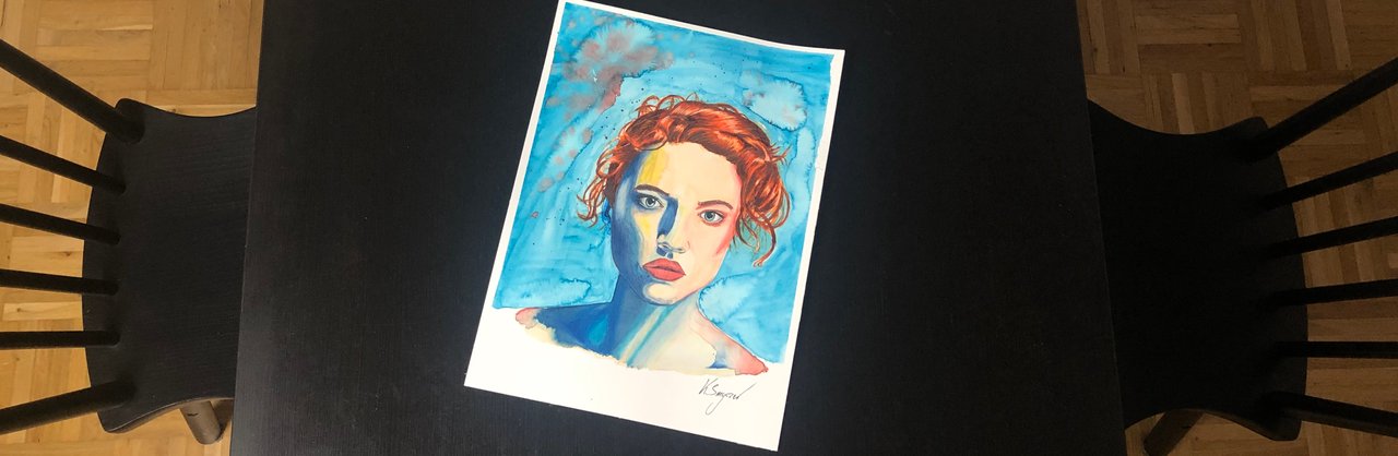
I posted several photos of the same artpiece under a different light source so you can see the differences:

Table lamp: Here you clearly see how the light is changing how you see the colors. This effect is more intense the closer you get to the bulb. You get a warm yellow influence here.

LED light: It has a strong source of focused white LED-light. It is not changing the colors on the paper like the yellow table lamp and it is less dispersing than the Softbox Lighting Kit (this is the reason why you see a reflection on the wooden table plate – I will talk more about reflections later in this article).

Soft box lighting:

The whole area is flooded with a diffuse light.

Light position:

Next important point is the positioning of the light. You already read, that the table lamp changes how you see the colors. This effect is stronger or weaker depending on how close you are to the bulb – so the position matters – but there is more to it: Reflections.

Specific light sources create more reflections than others. Lights sources with diffuse light create less reflections. A table lamp (with a white LED source) for example creates a strong reflection. And you are going to see them, when the light source is positioned in a way like in the following picture:

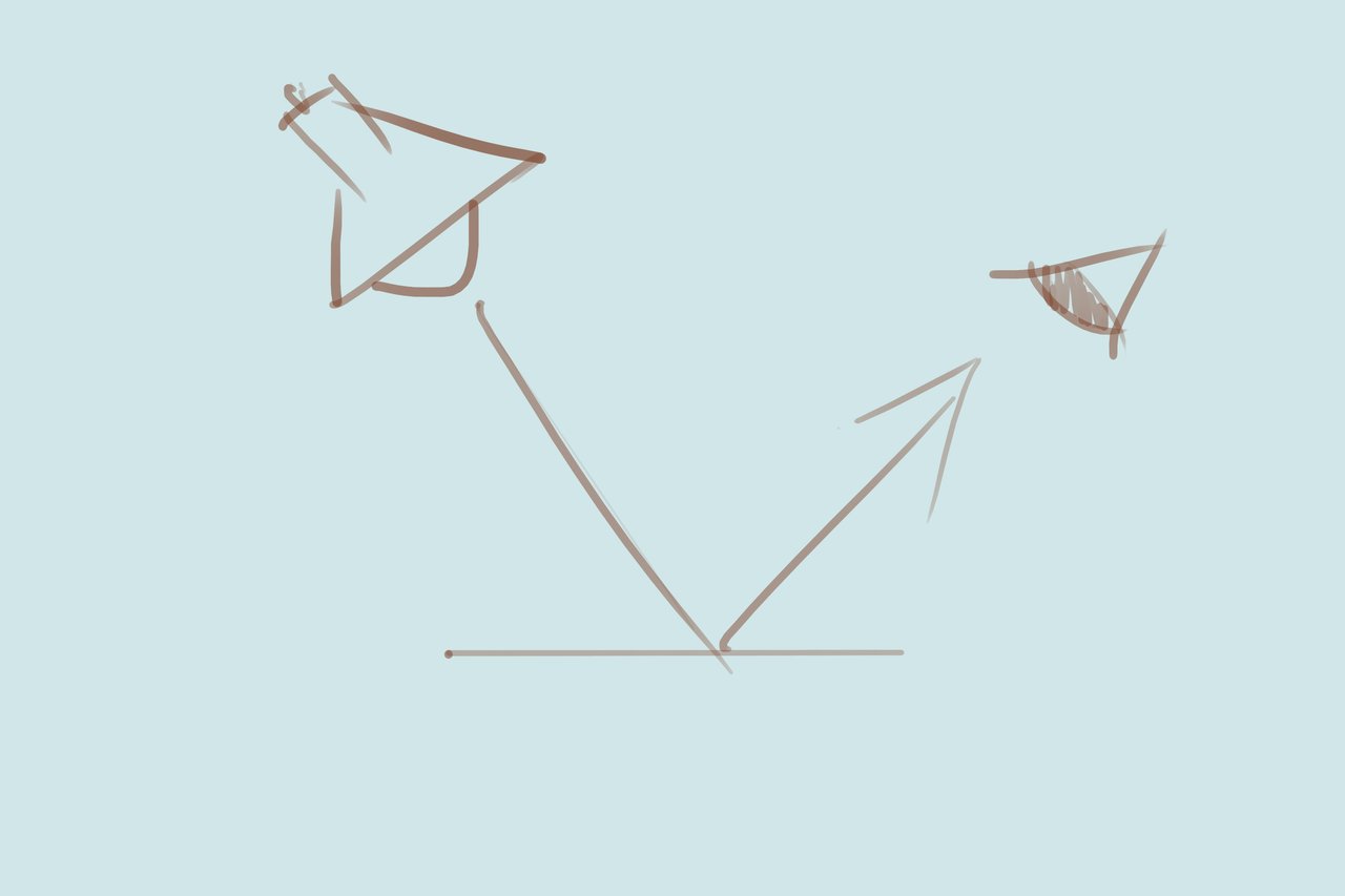
Additionally when you are recording your paintings you might not see a reflection but still a reflection appears in your video and the result won't be satisfactory. This happens when you position it as follows:

So you need to pay attention on reflections. Another disadvantage of light sources which are close to your artpiece is, that they are in your way. They disturb when you want to find a nice angle for your cam or they are blocking your own sight on the paper.

Pro Tip: Don't always position your cam 100% above the paper. It gives your recording an interesting edge when you record it from the side.

So all in all my recommendation is the Soft Box Lighting Kit:

- Diffuse – so no reflections

- Not blocking your sight

- Lighting the whole area

- Not changing the color on paper

- Not too pricy

You can find it on Amazon. Here you find a link (no paid advertisement):

https://www.amazon.de/gp/product/B01EFBCGFQ/ref=ppx_yo_dt_b_asin_title_o06_s00?ie=UTF8&psc=1

Time to grow up! Leave all those super heroes and movie characters behind. Get serious!

Not really...

But I got the chance to exhibit my art in a barber shop in june and july (first of all: wohooo! and: yes, there are barber shops which exhibit art). So this goes along with my plans to do portraits with challenging hair.

For my first portrait I used a photo of my girlfriend as a first reference. And here is the result:

Here you find the video:

https://www.cinnamon.video/watch?v=266626206764369894

(exclusively on cinnamon video since the new embedding feature kicks ass!)

If you want to see my commented version of the video where I give you tips about which techniques I used, subscribe for the web monetization content!

Read more...

Just recently I made a channel update – where I did announce that I want to make a video introduction prior to every fast forward video where I am talking about what I am about to do and what the picture is about. This was just one step of reshaping my channel to improve the quality of my posts.

Next step I want to take is to have a dedicated logo for my channel. And I don't just want a logo. I want it to be animated. Very simple and clean – but animated. And who is a better animator in the XRP-community than Jonnie Lawrence (@_jonnyLawrence). His work is very famous amongst XRP-enthusiasts. One of my favourite ones is the currency swapper (at least that's what I am calling it).

You can see it on twitter:

https://twitter.com/_JonnyLawrence/status/1165971707678593026?s=20

So I asked him if he can animate the picture I used in this post as a header. Turns out – he can:

https://www.cinnamon.video/watch?v=257087845666128970

https://www.youtube.com/watch?v=UzDmcY9EC0Q&feature=youtu.be

What I really enjoy is that you can see the structure of tha paper in the signature. It's artsy but still simple enough not to distract the viewer. Fantastic!

Thanks, Jonny!

When I first started out with colored pencils I really enjoyed how detailed you can work with them. You still have to pay attention on your technique since only a specific amount of layers can be added. This amount of layers is also related to the amount of pressure you apply. The color of the pencils sticks because of the roughness of the used paper. When you press it flat – it won‘t take any more layers.

But when you apply only a low amount of pressure it takes a lot of time to create so many layers so the paper underneath can't be seen anymore.

So I got this idea and validated it on the internet: You actually can combine watercolor and colored pencils. So it was a new technique I wanted to try.

If you remember my car picture of the AUDI TT I wanted to use tombow brushpens as ground color and combine it with colored pencils. But the brushpens didn‘t give me that smooth ground color I wanted to have. So I tried to rescue the picture with water colors. The result were so many layers which made it hard to apply the pencils.

So this time I immediately started out with water color. To make it a little harder I chose a picture where a person‘s or creature‘s flesh was glowing from within. What a challenge! So, here is my version of Lilith, daughter of hatred, creator of sanctuary. 😈

Cinnamon Video

https://www.cinnamon.video/watch?v=255102624674612250

Youtube

https://www.youtube.com/watch?v=nLsQ8WZUFGg&feature=youtu.be

Read more...

The Decade“ - that is in fact what Decennium means. What a great fit for the start of the 20‘s! Only 222 exist of this beast. I decided to make number 223.

It came out 2019 to celebrate the 10th birthday of the V10 engine of the AUDI R8 which had it‘s first inception in 2009. But in this article this car is here to mark a powerful start into 2020. Onward!

Done with Photoshop in about 20 hours paying a lot of attention to the details.

Here is the my fast forward video on Cinnamon Video.

https://www.cinnamon.video/kass/watch?v=234785511795852384

And here on Youtube.

https://www.youtube.com/watch?v=hZj7h-fD3uQ

As always I also made a video explaining how I did the drawing – what main challenges were and lessons I learned.

Just subscribe to unlock this content.

Let me know on Cinnamon Video or Twitter what you think!

Here is my Twitter contact: @KassjanS

Read more...

For New Years Eve I left europe for a few weeks and went to Las Vegas. There I visited Pinot's Palet at Boca Park to try out new things:

  1. Painting with acryl colors on a bigger canvas
  2. Drinking wine while painting

And “YES” wine has it‘s positive effect on art. Especially when you are trying something new – like I did – you don‘t bother having too much thoughts about every single brush stroke. But instead you just let it flow. So let's get started!

Today's task was to create a snow landscape. There were ten people attending the class. Everybody has own colors, brushes and a canvas. In the same room was also a bar where the art students were able to order drinks.

There was one teacher painting the picture from scratch. She used a microphone to be easily heard and the canvas itself was magnified on a flatscreen on the wall. By the way: Even when I am using words like “students“ and “teacher“ it didn‘t feel like school at all. Rather like a come-together with friends. The atmosphere was very relaxed and we didn't even have to paint this particular landscape. If you wanted to paint a T-Rex – paint a T-Rex!

I went there with my girlfriend and two more friends. And one of them was literally ignited by the effect alcohol can have on your very own creative process. He took the phrase “draw what you see” literally. It always cracked me up when I was watching his painting. Later more...

Here is my result. I put the photos I took during the process and cut them together into one video. This time it is less a “how-to” video but rather to give an impression how easy you can create nice painting within just 2 hours. The results of every attendant were great and everybody gave his or her picture it's own stamp.

First the Cinnamon Video Link:

https://www.cinnamon.video/kass/watch?v=229261174745597161

And here is YouTube:

https://www.youtube.com/watch?v=ZMKgNzihIHo&feature=youtu.be

In this post's subscriber-only content you will find that painting of my friend which made me laugh so hard and a picture of us as a group before the painting action started!

I see you on Coil.

Auf Wiedersehen!

Read more...

2019 has ended recently. And the end of a year is always the time when people do a recap of the last 12 months. I find this time also very useful to re-evaluate your aims. Like an iterative process. To think about what has been achieved – if that fits into former expectations – and to change something if necessary. So I thought back about how I came to Coil. It was through my interest in XRP. And I wanted to support the XRP-eco system by becoming a member. For me this is some kind of passive support. And I wanted to get more involved. So I became a content creator and shared my artwork. The 80-20 rule was a very good advice how to structure my posts. 80% free (video + text about the artwork) and 20% for subscribers (same video but added comments + used materials). And I really enjoyed the result!

Now I want to further increase the involvement.

I read a really nice article written by @consistentbenny with the title „A New Year's Game Plan for the Coil Community“.

He was referring to another article published by Ben Sharafian, CTO of Coil. There was one quote which inspired me to take action:

„We need enough users to matter.“

So I am thinking about ways to draw more attention and engagement to my articles and to Coil in general.

So how am I planning to draw more attention to the platform? I already follow a lot of artists on other websites or apps. I will suggest to them to check this new kind of web-monetization out and to evaluate if it suits them.

Secondly I want to draw more attention to my articles with methods I have not been using before. I want to get creative here and I will report how certain methods worked out or not.

This is to make a difference. And I‘d love it to know that my articles did their (small) impact.

I am closing chapter 1 with a short video of some of my 2019 pictures. Note: There is still a lot of space on my wall!

If you want to get a glimpse on what I am doing right now – just unlock my subscriber-only content!

https://youtu.be/vEFmXNblZmE

https://www.cinnamon.video/kass/watch?v=223489585965958504

Read more...